
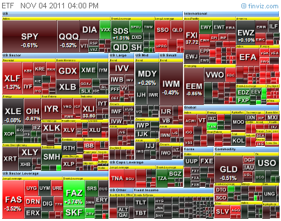
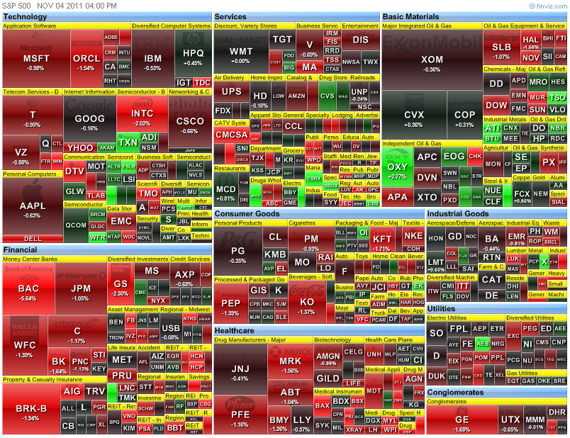
(Click on the Picture to Zoom in for better clarity)
http://www.amibroker.com/library/list.php
Just get into the link and search for "Heatmap".
This tool can use to display and sort data for 4 up to 100 symbols at one time. It allows user to change the sort options, such as Change %, Volume, ADX Trend etc, and will display the data with the result and color coding.
It can use in real-time, daily, weekly, etc... to compare their relative strength at a glance.
Jorgen, thank you again for your generousity in sharing an excellent piece of work.
Bless You,
.jpg)


3 Comments->:
Cool thanks. Yes, heatmaps are a great market visualization tool. I have a heatmap App on my Apple iPad called Heatmap by Ivory Bull that I use and love. In seconds you can understand relative price and volume relationships and spot opportunities.
is that posible to share your code?
Thank You and that i have a swell supply: How Much House Renovation Cost house makeover
Post a Comment